Food Packaging Design Mistakes That Cost Your Brand — And How to Get Them Right
Every food business depends on packaging to protect products, communicate brand identity, and deliver a positive customer experience. Yet many restaurants, takeaway operators, and food distributors repeat the same packaging mistakes — eroding brand value, confusing customers, and wasting money on reprints. Whether you are launching a new product line or refreshing existing packaging, understanding the most common pitfalls helps you make smarter decisions from the start.
1. Sacrificing Clarity for Creativity
It is tempting to make packaging visually striking, but if a customer cannot immediately tell what the product is, the design has failed. Clarity should always come first.
- Show the product or its category clearly on the front panel.
- Use concise descriptors instead of vague branding language.
- Make sure size, flavour, and quantity are visible at a glance. For importers and distributors ordering custom-printed packaging, requesting a physical sample before committing to a full production run is one of the most effective ways to verify that the final print communicates clearly.
2. Overloading the Design with Text
Too much information on a single surface creates visual noise. Customers scanning a shelf or opening a delivery bag want fast answers, not an essay. What to do instead:
- Limit front-of-pack text to brand name, product name, and one or two key benefits.
- Move detailed information — ingredients, nutritional data, storage instructions — to the back or bottom panel.
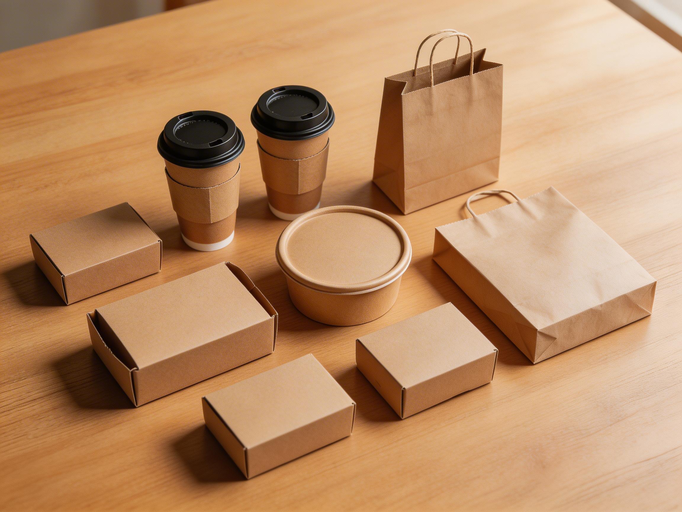
- Use icons and short phrases instead of long paragraphs where possible. This principle applies equally to paper cups, kraft bowls, takeaway boxes, and paper bags. A clean layout signals professionalism and makes the product easier to identify.
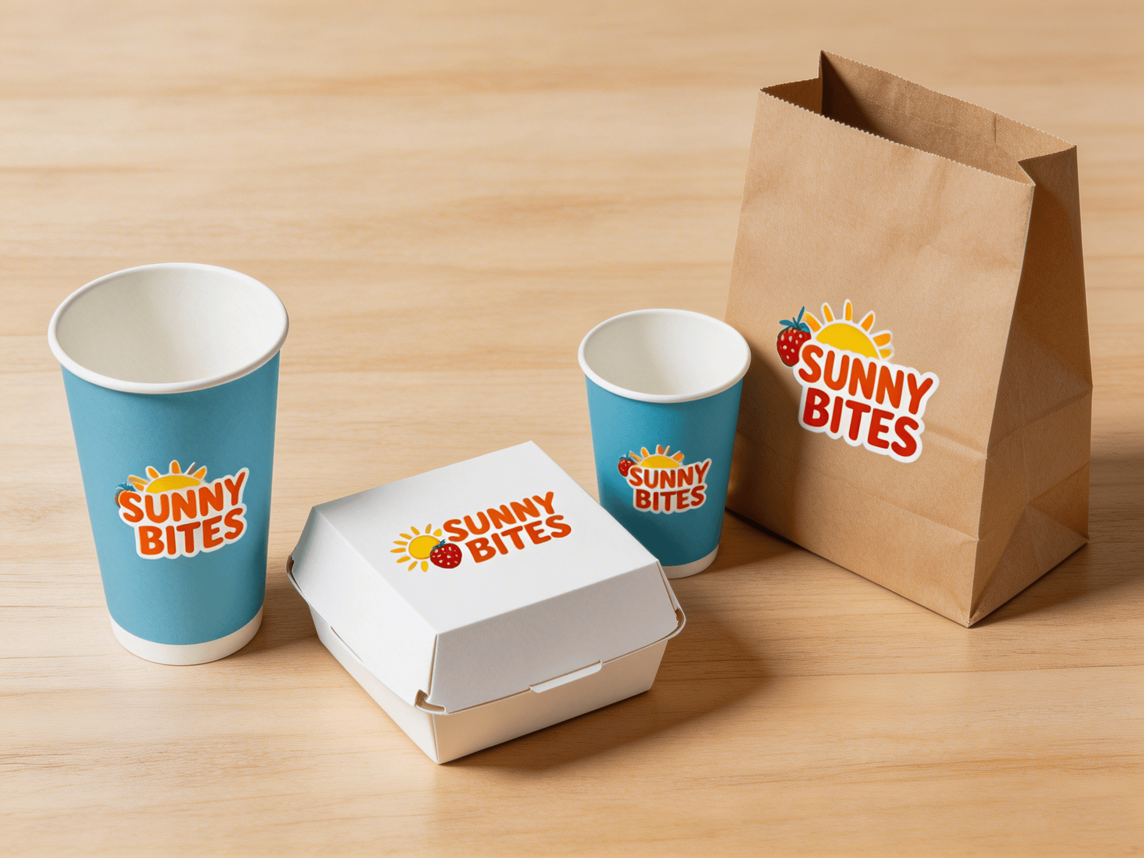
3. Making the Brand Name Too Small
Your brand name is the single most important element on any piece of packaging. If it is too small, placed in an awkward position, or printed in a colour that blends into the background, you are losing free advertising every time a customer carries your cup or bag out of the store. Best practice:
- Make the brand name one of the largest text elements on the pack.
- Position it where it will be visible when the product is in use — for example, on the side of a cup that faces outward, or on the front face of a paper bag.
- Ensure strong contrast between the brand name and the background colour. When sourcing custom-printed packaging, ask your supplier for a digital proof that shows the actual print size on the product. This avoids surprises when the order arrives.
4. Ignoring Typography and Readability
Decorative fonts may look attractive on screen but can be hard to read on a curved surface or small print area. Common problems include:
- Script or handwriting fonts that become illegible at small sizes.
- All-caps text in long lines, which slows reading speed.
- Font sizes that are too small for the target audience, especially for takeaways where customers may be reading in low light. Tips:
- Stick to one or two complementary typefaces.
- Use sans-serif fonts for essential information like product name and weight.
- Test readability at actual print size, not just on a monitor.
5. Skipping Proofreading Before Print
A single typo on a printed cup or box can undermine months of brand-building. Misspellings, grammatical errors, and incorrect nutritional information are not just embarrassing — in some markets they may also trigger regulatory issues. Build a review checklist:
- Has every line of text been proofread by at least two people?
- Are all regulatory elements (weight, allergens, best-before format) correct for the destination market?
- Does the artwork file match the final approved version? Working with a packaging supplier that includes artwork checking as part of its quality control process adds a safety net. At TakeawayPack, for example, artwork verification is a standard step before production begins on custom-printed orders.
6. Choosing Style Over Function
A beautiful package that leaks, collapses, or fails to keep food at the right temperature damages the customer experience far more than a plain but functional one. Functional priorities to consider:
- Leak resistance — especially for soups, sauces, and oily foods.
- Structural strength — takeaway boxes and bowls must survive delivery without crushing.
- Temperature performance — hot food should stay hot; cold food should stay cold.
- Material compatibility — some coatings are not suitable for microwave use; others may not comply with food-contact regulations in certain regions. Discuss your product requirements with your supplier early in the process. A reliable packaging partner can recommend the right material, coating, and construction for your specific food type and supply chain conditions.
7. Overlooking Sustainability Messaging
More food businesses and their end consumers are asking about the environmental profile of packaging. Ignoring this trend is a missed opportunity to differentiate. This does not mean making exaggerated claims. Instead:
- State clearly what materials are used and whether they are recyclable, compostable, or made from recycled content.
- Avoid vague terms like "eco-friendly" without supporting detail.
- Ensure any environmental claims are accurate for the markets where the product will be sold — definitions of "compostable" and "biodegradable" vary by region.
Getting Packaging Right from the Start
Avoiding these common mistakes comes down to a few core principles: prioritise clarity, test before you commit, and work with a supplier that supports you through the process — from artwork review to pre-shipment inspection. If you are planning a custom packaging project for your restaurant chain, distribution business, or food brand, TakeawayPack offers flexible MOQ, artwork checking, sample support, and mixed-product sourcing across paper cups, takeaway boxes, kraft bowls, paper bags, and more. Contact the team at info@takeawaypack.com to discuss your next project.